2026-05-12
TIR's flag design
Six countries, seven flags (the last one being Starcorp). I pulled most of these designs out of my ass, but I'd still like to talk about them, especially Bauhinia's.
Bauhinia

Bauhinia's flag, as you can well imagine, is inspired by Hong Kong's. But should you compare them, I'd still get mad because I'm a huge hypocrite.
But the problem was, when I first drew it, it looks very ugly no matter what. It felt like the petals were just sticking out awkwardly, and I have no idea why. So I went back and studied Hong Kong's flag more, and this is what I found.
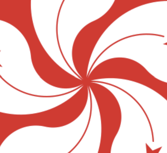
Firstly, the petals aren't actually connected to each other. Secondly, the negative space in between the petals made another flower, small and red.
In my final flag, I still ended up connecting the petals because thick wobbly pen strokes and shit, and also I thought the negative space part was more important. And now my flag also looks pretty now!
Starcorp
There's not much to talk about here. I just put Starcorp's logo in the center and filled the background with a lighter blue.

And Starcorp's logo is designed out of my ass too, but an important note is for the two streaks, their ends should be on the same line. For no particular reason. In this flag, though, they are not on the same line because I couldn't work any decent SVG editing software and just winged it in Scratch's editor and Figma.
Fanton

If I told you that the white thing is supposed to be the splash after a drop of water hit a body of water, would you believe me? You have to. You can also interpret it as a lotus flower. The more interpretations the better.
Atlasia

No comment.
Moreland

Alright this is one of the ugly ones. I traced over a picture of a moose and just slapped that on. But originally, the background was green with a more yellowish circle in the middle. I later decided that's too ugly (ignoring the elephant in the room, or should I say moose in the room), and changed it to this two-sided pattern.
Sylvandia

Pretty! This might be my second favorite, after Bauhinia. And it actually has symbolism! Aside from the obvious, that is. Each star is a state, for the five states in the federation.
Westavia

The seven-point star is an important Westavian symbol. The rest is out of my ass. Yay! Flag design is so easy!
I'm still really satisfied with all these flags. They're all very indicative of their countries.