2025-10-07
Site doc: characters popping up when hovered
Out of boredom I'm going to write about how I did some of the stuff I did on my site. You can reference this and I hope this can help you, but remember that not everyone's use case is exactly the same, so always make sure you know what a code is doing before copying!
If you go to the index page of my TIR site you will find a grid of cards with characters drawn on them, that will pop up when you hover over them.
Contents
The grid itself
Grid Garden is a fantastic resource for learning CSS grids. The grid part is fairly simple. Just a regular old grid.
.grid {
	display: grid;
	grid-template-columns: repeat(auto-fill, minmax(250px, 1fr));
	grid-auto-rows: 1fr;
	gap: 2em;
	margin: 2em 0;
}
The minmax(250px, 1fr) means that each individual column will be 1fr (one fraction) wide, which means every column will be the same width. But if they're smaller than 250px in width, they will reduce the number of columns until they're bigger than 250px again. This makes the two columns collapse into one on smaller screens.
The auto-fill bears no difference to its alternative, auto-fit here, but this article explains their differences well.
grid-auto-rows makes sure each row is 1fr no matter how many rows there are.
Two of the cards, "Characters" and "World," are bigger than the rest. They simply have the big class.
.big {
	grid-row: span 2;
}
Meaning they will span 2 rows.
In the grid, I made 10 <a>s that are the cards you see. Inside each <a> there is a <div> element that contains the background image and text.[1]
The popups
I put the character art as background images on the <div>s. Here are the pictures:
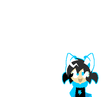


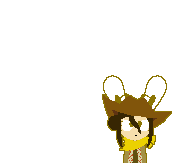


They are the same size as the cards on a 1920px screen. Sparky and Buttercup are bigger because their cards are bigger.
The base code for background placement looked like this.
.card {
	background-size: cover;
	background-position: center calc(var(--font-size) * 3);
	background-repeat: no-repeat;
	image-rendering: pixelated;
}
image-rendering: pixelated stops the browser from blurring pixel art. background-position: center centers the background horizontally, and the calc(var(--font-size) * 3) after it lowers it vertically by a certain amount. You see why I included the font size in a later section.
For the big cards, I lowered them further by 10px for some reason. It took tweaking and trying.
.big .card {
	background-position: center calc(var(--font-size) * 3 + 10px);
}
On hover, I simply set the vertical background position to 0 (center 0).
For the big cards, there was a problem. There was a little gap between the bottom of the character and the bottom border of the card, which I hate. So I'm tweaking and trying again, ending up with center calc(var(--font-size) / -4 + 20px).
Animation
The good old transition. In Chrome DevTools, there is a handy little bezier curve tool — just click the little symbol next to a cubic-bezier(…) CSS function. Here's mine.
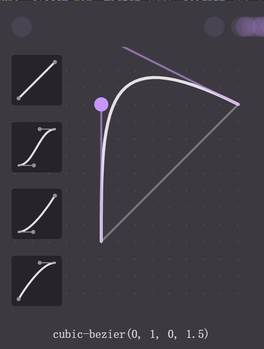
You can see that my animation makes them go overboard a little before returning back to the target value. This is what made them bounce.
.card {
	transition: all .3s cubic-bezier(0, 1, 0, 1.5);
}
Responsiveness
If I had used pixel values for my offsets, they wouldn't have been mobile-friendly. That's why I used my --font-size variable.
The value of the variable is this: clamp(16px, 0.75rem + 0.8vw, 24px).
It's called "fluid typography," meaning font size changing with screen size. It grows on bigger screens and shrinks on smaller ones!
The clamp function clamps the middle value (0.75rem + 0.8vw) between a minimum (16px) and a maximum (24px); and with vw (viewport width), the middle value changes with screen width.
I didn't write the damn thing myself; it looks horrifying. I used a nice tool here.
By using this variable in calculating the background offset, I get to make it responsive. I also calculate the heading sizes based on this variable so all the text shrinks and grows properly!
-
Why didn't I just use the
<a>? I don't know; I must've had my reasons. ↩︎